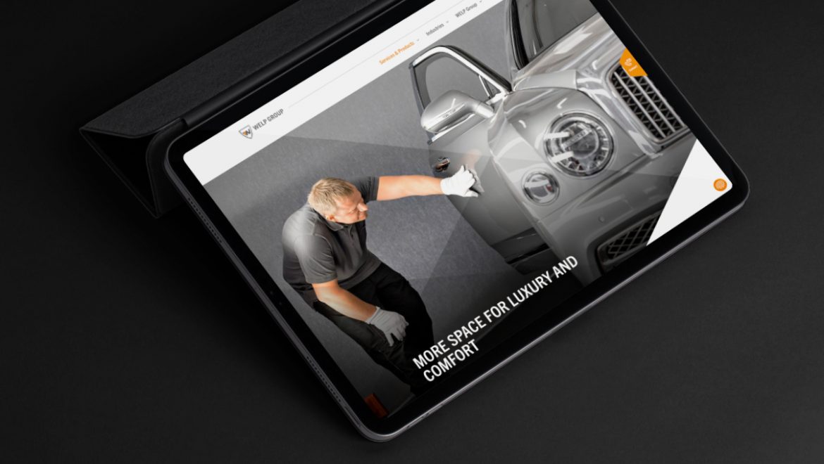
WELP GROUP – Corporate Website 6. February 2021 Portfolio Some parts of my portfolio are password protected. If you have the password, please enter it here. Password:
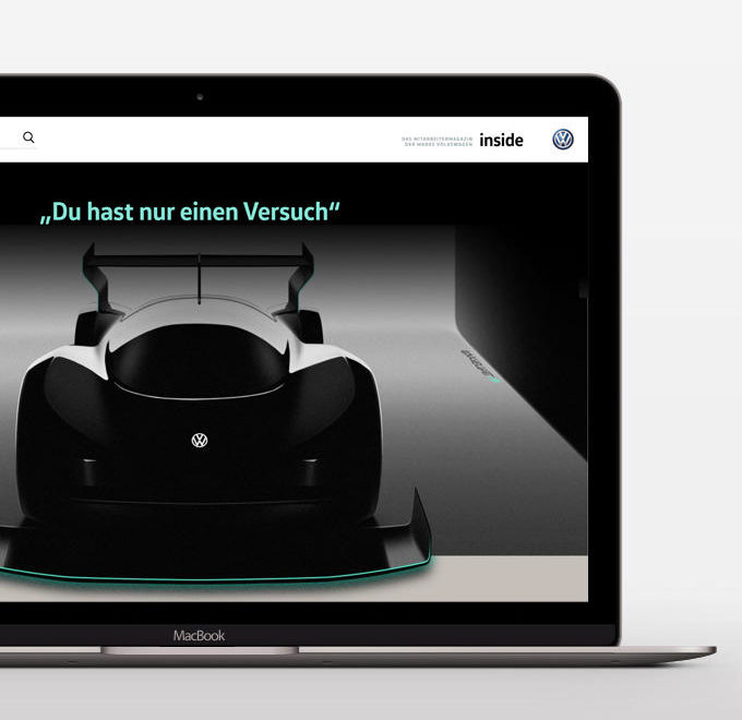
Volkswagen – Employee Online Magazine 11. January 2018 Portfolio Some parts of my portfolio are password protected. If you have the password, please enter it here. Password:
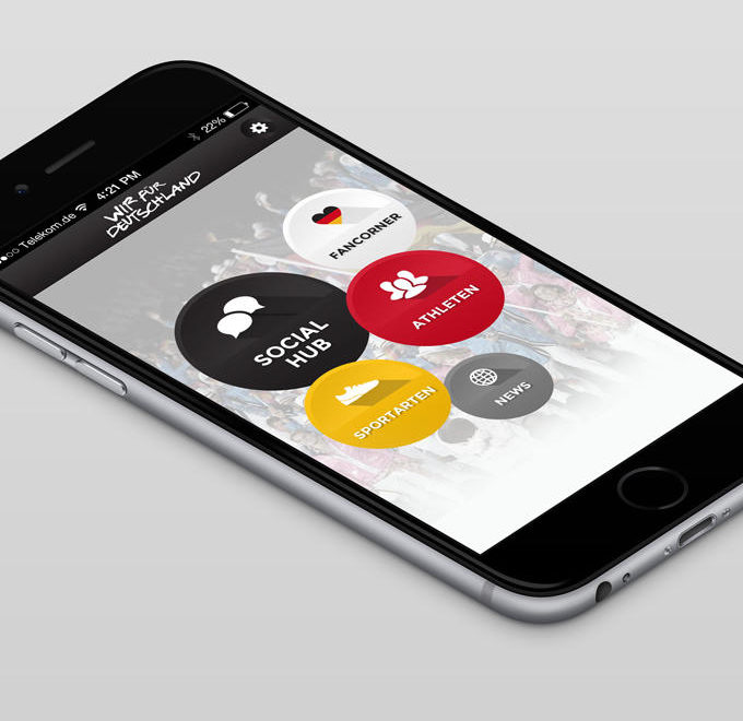
German Olympic Sports Confederation – Fan App 2. December 2016 Portfolio Some parts of my portfolio are password protected. If you have the password, please enter it here. Password:
Waschbaer.de – E-commerce 3. August 2016 Portfolio Some parts of my portfolio are password protected. If you have the password, please enter it here. Password:
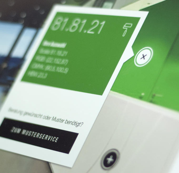
Brillux Colore – Online Magazine Concept 4. September 2015 Portfolio Some parts of my portfolio are password protected. If you have the password, please enter it here. Password: